Data Interpretation Questions Practice Question and Answer
8 Q:Direction: Percentage of different types of employees in a company in two consecutive years.
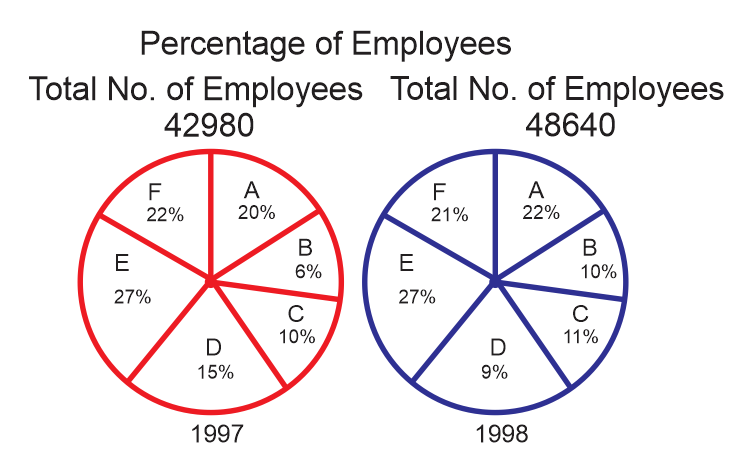
From 1997 to 1998 in the case of which of the following types of employees the change was maximum ?
1431 05e3274b41f7362736228359d
5e3274b41f7362736228359d- 1Cfalse
- 2Dfalse
- 3Btrue
- 4Afalse
- Show AnswerHide Answer
- Workspace
- SingleChoice
Answer : 3. "B"
Q:Pie chart shows the percent of money spent by family on various item during 1999. Study the graph and answer these questions.
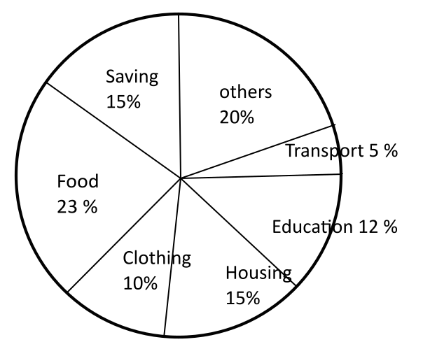
The ratio of the total amount of money spent on housing to that spent on education was
1426 05fb4e543bf36696eb8268137
5fb4e543bf36696eb8268137- 15:2false
- 22:5false
- 34:5false
- 45:4true
- Show AnswerHide Answer
- Workspace
- SingleChoice
Answer : 4. " 5:4"
Q:Directions: The following graph gives Sales, Expense and Capital of a company for a period of five years 1994 to 1998. Read the graph and answer the following questions.
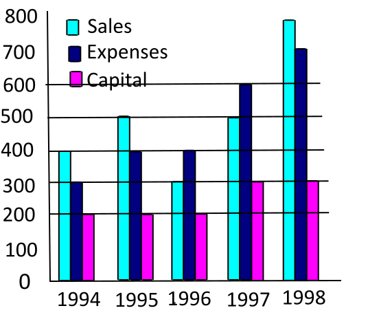
In which year was the Sales to Expense ratio the lowest?
1421 05f40e2e89b782961da3f873c
5f40e2e89b782961da3f873c- 11994false
- 21996true
- 31997false
- 41998false
- Show AnswerHide Answer
- Workspace
- SingleChoice
Answer : 2. "1996"
Q:Directions: The bar chart given below shows the percentage distribution of the production of various models of a mobile manufacturing company in 2007 and 2008. The total production in 2007 was 35 lakh mobile phones and in 2008 the production was 44 lakh. Study the chart and answer the following questions.
Percentage of six different types of mobiles manufactured by a company over two year
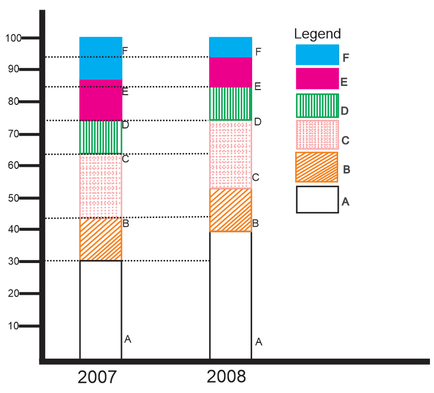
If the percentage production of A type mobiles in 2008 as same as that in 2007, then the number of A type mobiles produced in 2008 would have been
1421 05dd6849ac2282c484e4ca5c6
5dd6849ac2282c484e4ca5c6Percentage of six different types of mobiles manufactured by a company over two year
- 114,00,000false
- 213,20,000true
- 311,70,000false
- 410,50,000false
- Show AnswerHide Answer
- Workspace
- SingleChoice
Answer : 2. "13,20,000 "
Q:Directions: Study the following pie chart carefully and answer the questions given beside.
The following pie chart gives the information about breakup of six different categories of workers in a company.
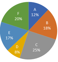
The number of Category B workers is what percentage more than that of category D workers?
1420 0601a54e308ff1450d90c7983
601a54e308ff1450d90c7983The following pie chart gives the information about breakup of six different categories of workers in a company.
- 1140%false
- 2120%false
- 3100%false
- 4125%true
- Show AnswerHide Answer
- Workspace
- SingleChoice
Answer : 4. "125%"
Q:Study the following table and answer the equation:
Number of cars sold by dealers A, B, C, D and E during first six
months of 2018.
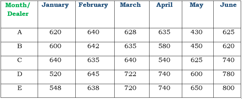
In July 2018, if the sales of cars by the dealer D increases by the same percentage as in June 2018 over its previous month, then what is the number of cars sold by D in July 2018 ?
1419 0619e09272f80a134c81c10c4
619e09272f80a134c81c10c4Number of cars sold by dealers A, B, C, D and E during first six months of 2018.
- 11014true
- 2975false
- 31020false
- 4959false
- Show AnswerHide Answer
- Workspace
- SingleChoice
Answer : 1. "1014 "
Q:Direction: Study the following graph carefully and answer the following questions.
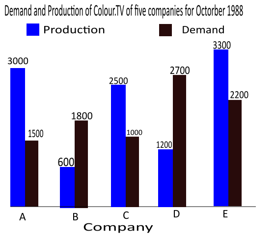
What is the difference between average demand and average production of the five companies taken together?
1419 060069d987a0c6e1017e04e41
60069d987a0c6e1017e04e41- 1400false
- 2138false
- 31400false
- 4280true
- Show AnswerHide Answer
- Workspace
- SingleChoice
Answer : 4. "280"
Q: The following pie chart gives the measures of the central angles of the sectors that reflect the number of beds in each of 7 different hospitals with respect to the total number of beds in these 7 hospitals taken together.
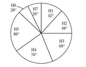
If the number of beds in H7 are 39, then what is the total number of beds in all the 7 hospitals taken together?
1418 0642251abdcb650c1456482a5
642251abdcb650c1456482a5- 1720false
- 2540true
- 3450false
- 4630false
- Show AnswerHide Answer
- Workspace
- SingleChoice