


Data Interpretation Questions Practice Question and Answer
8 Q:Directions: The following pie chart show proportion of population of seven villages in 2009. Stud the pie chart and answer question that follows:
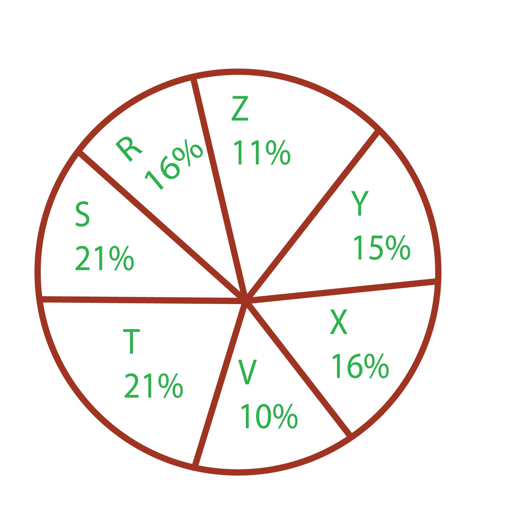
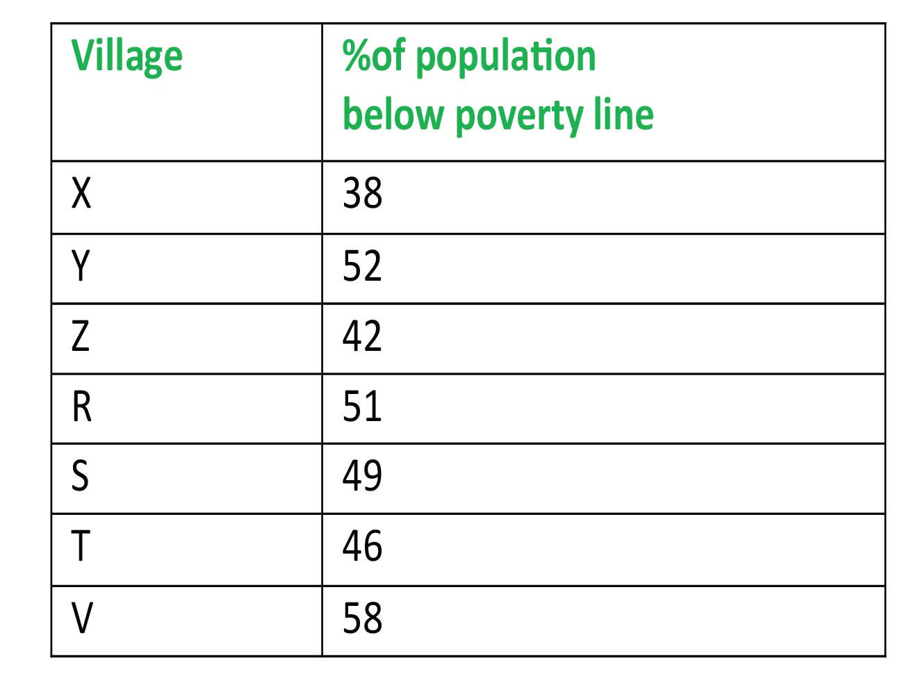
The ratio of the below poverty line population of village 'T' to that of the below poverty line population of village 'Z' is
988 06408769836c856ead7990286
6408769836c856ead7990286- 111: 23false
- 213: 11false
- 323: 11true
- 411:13false
- Show AnswerHide Answer
- Workspace
- SingleChoice
Answer : 3. "23: 11"
Q:Directions : Given here is a pie chart showing the cost of gold in 2010, 2011, 2012 and 2013. Study the chart and answer the following questions
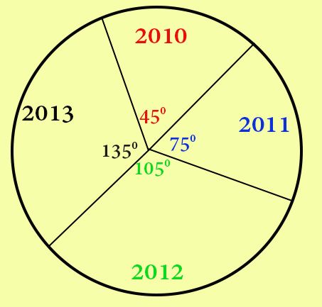
The percentage increase in the price of gold from the year 2011 to 2013 is
987 064539e95f3618908bf5e0c4e
64539e95f3618908bf5e0c4e- 150%false
- 260%false
- 370%false
- 480%true
- Show AnswerHide Answer
- Workspace
- SingleChoice
Answer : 4. "80%"
Q:Directions: A survery of film watching habits of people living in five cities P, Q, R, S and T is summarised below in a table. The coulmn I in the table gives percentage of film-watchers in each city who see only one film a week. The column II gives the total number of film-watchers who see two or more films per week.
Read the table and answer the following questions.
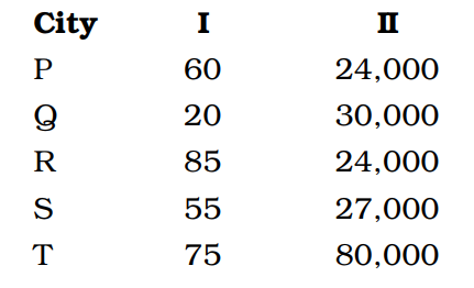
A city with the lowest number of film-watchers is :
986 0632db5b31656651c9eaaf4f1
632db5b31656651c9eaaf4f1- 1Pfalse
- 2Qtrue
- 3Rfalse
- 4Sfalse
- Show AnswerHide Answer
- Workspace
- SingleChoice
Answer : 2. "Q "
Q:Directions : Given here is a pie chart showing the cost of gold in 2010, 2011, 2012 and 2013. Study the chart and answer the following questions
If the price of gold in 2013 is Rs. 31,500 per 10 gram, then the price of gold in 2011 per 10 gram is
983 064539c6813eb5908ae354318
64539c6813eb5908ae354318- 1Rs. 17000false
- 2Rs. 17500true
- 3Rs. 18000false
- 4Rs. 18500false
- Show AnswerHide Answer
- Workspace
- SingleChoice
Answer : 2. "Rs. 17500"
Q:Directions : Study the following bar graph and answer the questions.
company (in lakhs of rupees) for the years 1994-1997:
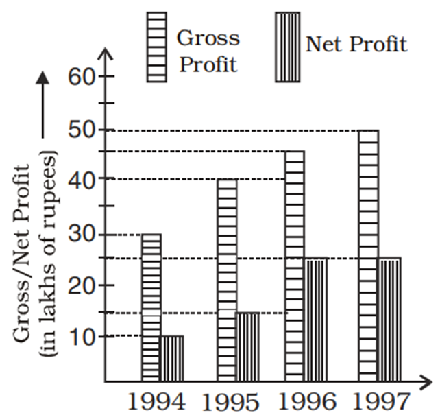
The difference of average gross profit and average net profit calculated for four years is
980 06460f5b04f2cce984334df0c
6460f5b04f2cce984334df0c- 118.75 lakhsfalse
- 219.75 lakhsfalse
- 320.5 lakhsfalse
- 422.5 lakhstrue
- Show AnswerHide Answer
- Workspace
- SingleChoice
Answer : 4. "22.5 lakhs "
Q:Directions: Study the Bar diagram carefully and answer the questions.
The Bar diagram shows the trends of foreign direct investment (FDI) into India from all over the World (in Rs. crores).
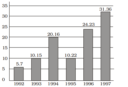
The ratio of investment in 1997 to the average investment is
979 063a56accbe1dca1b35d2e916
63a56accbe1dca1b35d2e916 - 12 : 1true
- 21 : 2false
- 31 : 1false
- 43 : 1false
- Show AnswerHide Answer
- Workspace
- SingleChoice
Answer : 1. "2 : 1"
Q:Directions: The pie– chart shows the proposed outlay for different sectors during a Five–Year plan of Government of India. Total outlay is Rs. 40,000 crores. By reading the pie–chart answer the following three questions.
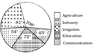
What is the proposed outlay for Education?
979 06489a3f7b90df94e034c7e06
6489a3f7b90df94e034c7e06- 1Rs. 6000 croresfalse
- 2Rs. 8000 crorestrue
- 3Rs. 9000 croresfalse
- 4Rs. 7000 croresfalse
- Show AnswerHide Answer
- Workspace
- SingleChoice
Answer : 2. "Rs. 8000 crores "
Q:Directions: Read the below data carefully and answer the following questions.
The table shows the total number of ice cream (Chocobar + Cornetto) was given by Santa Claus on the day of Xmas to 5 children. It also shows the number of Chocobar ice-creams is how much more or less percentage of the total number of Cornetto ice-creams.
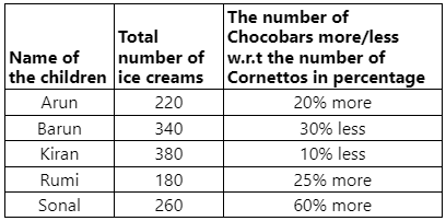
What is the average number of Chocobar ice creams they all have?
978 064dcca7380ef1e74b4edcbda
64dcca7380ef1e74b4edcbdaThe table shows the total number of ice cream (Chocobar + Cornetto) was given by Santa Claus on the day of Xmas to 5 children. It also shows the number of Chocobar ice-creams is how much more or less percentage of the total number of Cornetto ice-creams.
- 1140true
- 2240false
- 3320false
- 4150false
- 5560false
- Show AnswerHide Answer
- Workspace
- SingleChoice