Data Interpretation Questions Practice Question and Answer
8 Q:Directions : The bar graph, given here, shows the demand and production of colour televisions of five companies for Diwali season in the year 2009. Study the graph carefully and answer the questions based on the graph.
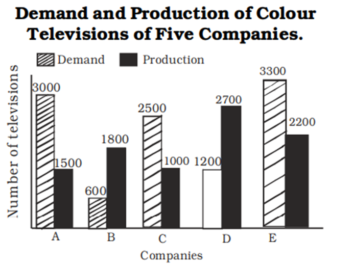
The ratio of companies having more demand than production of colour televisions to those having more production than demand is :
896 06461004c4f2cce984334e61f
6461004c4f2cce984334e61f- 12 : 3false
- 24 : 1false
- 31 :4false
- 43 : 2true
- Show AnswerHide Answer
- Workspace
- SingleChoice
Answer : 4. "3 : 2"
Q:Directions: The following Pie Chart shows the export of different food grains from India in 2010. Study the chart and answer the questions:
If the revenue from 1 quintal of crop A is thrice that from 1 quintal of crop C, then the ratio of the total revenues of A and C is
893 063be6b9f1b93047bc20cdf06
63be6b9f1b93047bc20cdf06- 11 : 6false
- 22 : 3false
- 33 : 2false
- 46 : 1true
- Show AnswerHide Answer
- Workspace
- SingleChoice
Answer : 4. "6 : 1"
Q:Directions: The following pie chart show proportion of population of seven villages in 2009. Stud the pie chart and answer question that follows:
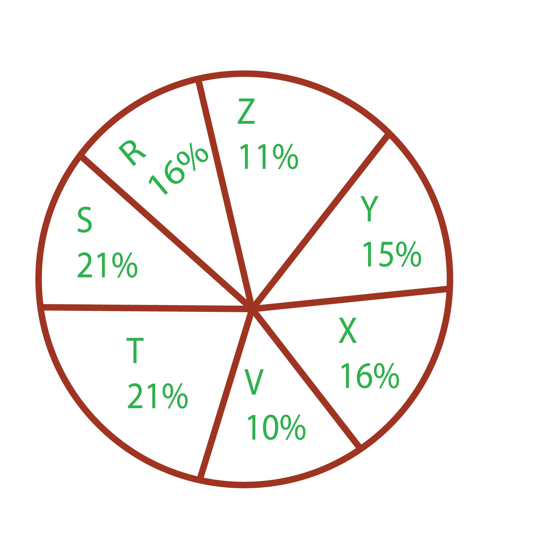
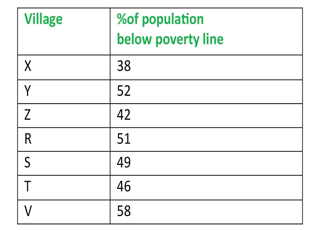
The ratio of the below poverty line population of village 'T' to that of the below poverty line population of village 'Z' is
891 06408769836c856ead7990286
6408769836c856ead7990286- 111: 23false
- 213: 11false
- 323: 11true
- 411:13false
- Show AnswerHide Answer
- Workspace
- SingleChoice
Answer : 3. "23: 11"
Q:Directions: The sub divided bar diagram given below depicts Higher secondary Students of a school for three years. Study the diagram and answer the questions

The number of students passed with 3rd division in the year 2008 was
888 0645ce82d4d91510a5da93b1f
645ce82d4d91510a5da93b1f- 150false
- 260true
- 370false
- 480false
- Show AnswerHide Answer
- Workspace
- SingleChoice
Answer : 2. "60 "
Q:Directions : Study the following bar graph and answer the questions.
company (in lakhs of rupees) for the years 1994-1997:
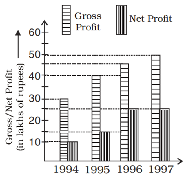
The difference of average gross profit and average net profit calculated for four years is
888 06460f5b04f2cce984334df0c
6460f5b04f2cce984334df0c- 118.75 lakhsfalse
- 219.75 lakhsfalse
- 320.5 lakhsfalse
- 422.5 lakhstrue
- Show AnswerHide Answer
- Workspace
- SingleChoice
Answer : 4. "22.5 lakhs "
Q:Direction: Read the following graph carefully and answer the following questions:
The following bar graph shows the quantity(in kg) of wheat, rice, pulses and salts sold by two companies P and Q in the month of January.
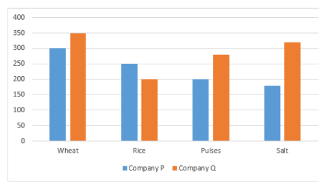
What is the difference between the quantity of salts sold by company P and Q together and the quantity of wheat sold by company P?
887 064ddf51d462ecdc3adb97191
64ddf51d462ecdc3adb97191The following bar graph shows the quantity(in kg) of wheat, rice, pulses and salts sold by two companies P and Q in the month of January.
- 190 kgfalse
- 2200 kgtrue
- 3150 kgfalse
- 4160 kgfalse
- 580 kgfalse
- Show AnswerHide Answer
- Workspace
- SingleChoice
Answer : 2. "200 kg"
Q:Directions: Study the following information carefully and answer the questions given below.
In the table, the percentage of shirts (formal and casual) sold out of the total number of shirts sold in the week and the number of casual shirts sold data related to the number of shirts sold on ve weekdays – Monday, Tuesday, Wednesday, Thursday and Friday are given.
Total number of shirts sold in the week = x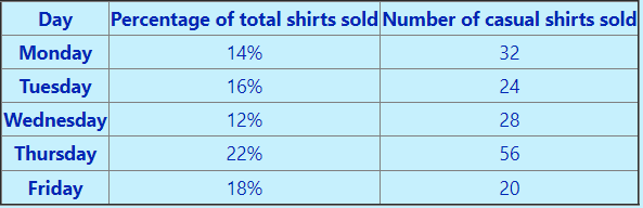 Note: Total number of shirts sold on Saturday and Sunday together = 72
40% of casual shirts sold and 25% of formal shirts sold on Friday of brand X, then the number of shirts sold of brands other than X on Friday is
886 064e5ef003be218b6cdc29ab1
64e5ef003be218b6cdc29ab1In the table, the percentage of shirts (formal and casual) sold out of the total number of shirts sold in the week and the number of casual shirts sold data related to the number of shirts sold on ve weekdays – Monday, Tuesday, Wednesday, Thursday and Friday are given.
Note: Total number of shirts sold on Saturday and Sunday together = 72- 121false
- 231false
- 341false
- 451true
- 5None of thesefalse
- Show AnswerHide Answer
- Workspace
- SingleChoice
Answer : 4. "51"
Q:Directions : Study the following pie chart carefully and answer the questions. The pie chart represents the percentage of people involved in various occupations.
Total number of people = 20000
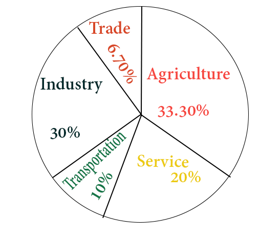
The ratio of the people involved in service to that in industry is
881 06453a49cf3618908bf5e16b4
6453a49cf3618908bf5e16b4Total number of people = 20000
- 11 : 2false
- 22 : 3true
- 33 : 4false
- 43 : 2false
- Show AnswerHide Answer
- Workspace
- SingleChoice