Data Interpretation Practice Question and Answer
8 Q:Directions: A survery of film watching habits of people living in five cities P, Q, R, S and T is summarised below in a table. The coulmn I in the table gives percentage of film-watchers in each city who see only one film a week. The column II gives the total number of film-watchers who see two or more films per week.
Read the table and answer the following questions.
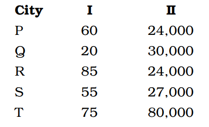
Which city has the highest number of film watchers who see only one film in a week?
867 0632db57a1656651c9eaaf48c
632db57a1656651c9eaaf48c- 1Pfalse
- 2Rfalse
- 3Sfalse
- 4Ttrue
- Show AnswerHide Answer
- Workspace
- SingleChoice
Answer : 4. "T "
Q:Directions: Given bar graph shows the number of plain books and lined books (in hundreds) available at three different stores and the table shows the percentage of total books (Plain + lined) that was sold by different stores.
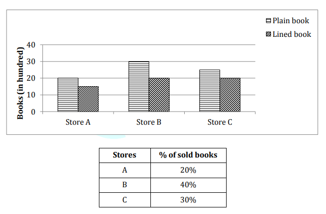
The number of plain books sold by store A and store B was 30% and 40% respectively then find the number of lined books sold by store A and store B together is what percent of total books available at store A?
866 064d5d641bd50dd8e2e15fefe
64d5d641bd50dd8e2e15fefe- 1$$22{6\over7}$$false
- 2$$23{4\over7}$$false
- 3$$25{5\over7}$$true
- 425%false
- 5None of thesefalse
- Show AnswerHide Answer
- Workspace
- SingleChoice
Answer : 3. "$$25{5\over7}$$"
Q:Directions : The expenses of a country for a particular year is given in Pie–Chart. Read the Pie– Chart and answer the questions.
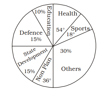
If the total amount spent by the Government during the year was ₹ 1,00,000 crores, then the amount spent on Health and Education together was
865 063ac3433612ead74ab54df8b
63ac3433612ead74ab54df8b- 1₹ 25,000 croretrue
- 2₹ 20,000 crorefalse
- 3₹ 30,000 crorefalse
- 4₹ 15,000 crorefalse
- Show AnswerHide Answer
- Workspace
- SingleChoice
Answer : 1. "₹ 25,000 crore "
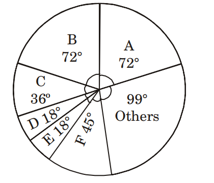
Q:Direction: Study the given pie chart carefully and answer the following questions accordingly. Given pie chart shows the percentage of players taking part in six different games in an event.
Total number of Players = 1800
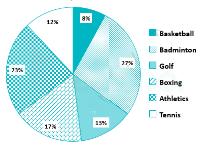
What is the difference between the total number of players taking part in Badminton and Boxing together and the total number of players taking part in Golf and Tennis together?
860 064e75ecd60749cb6f2eb117f
64e75ecd60749cb6f2eb117f- 1352false
- 2342true
- 3643false
- 4653false
- 5None of thesefalse
- Show AnswerHide Answer
- Workspace
- SingleChoice
Answer : 2. "342"
Q:Directions: The table given here shows the production of five types of cars by a company in the year 1989 to 1994. Study the table and answer questions.
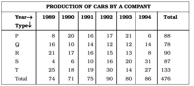
The production of which type of car was 25% of the total production of all types of cars during 1993?
854 0632db32a751e5310a5d0fc30
632db32a751e5310a5d0fc30- 1Strue
- 2Rfalse
- 3Qfalse
- 4Pfalse
- Show AnswerHide Answer
- Workspace
- SingleChoice
Answer : 1. "S "
Q:Directions: Following is the pie-chart showing the spending of a family on various items in a particular year
Study the pie chart and answer questions
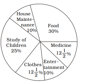
If the total amount spent on the family during the year was ₹ 35,000, the amount spent for study of children and food together was
851 063be6fa261d62119f1dbc4a2
63be6fa261d62119f1dbc4a2- 119,250true
- 219,500false
- 319,750false
- 419,850false
- Show AnswerHide Answer
- Workspace
- SingleChoice
Answer : 1. "19,250 "
Q:Directions: The following Pie Chart shows the export of different food grains from India in 2010. Study the chart and answer the questions:
If the revenue from 1 quintal of crop A is thrice that from 1 quintal of crop C, then the ratio of the total revenues of A and C is
850 063be6b9f1b93047bc20cdf06
63be6b9f1b93047bc20cdf06- 11 : 6false
- 22 : 3false
- 33 : 2false
- 46 : 1true
- Show AnswerHide Answer
- Workspace
- SingleChoice
Answer : 4. "6 : 1"
Q:Directions: Study the Bar diagram carefully and answer the questions.
The Bar diagram shows the trends of foreign direct investment (FDI) into India from all over the World (in Rs. crores).
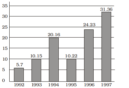
The ratio of investment in 1997 to the average investment is
848 063a56accbe1dca1b35d2e916
63a56accbe1dca1b35d2e916 - 12 : 1true
- 21 : 2false
- 31 : 1false
- 43 : 1false
- Show AnswerHide Answer
- Workspace
- SingleChoice