Data Interpretation Question and Answer


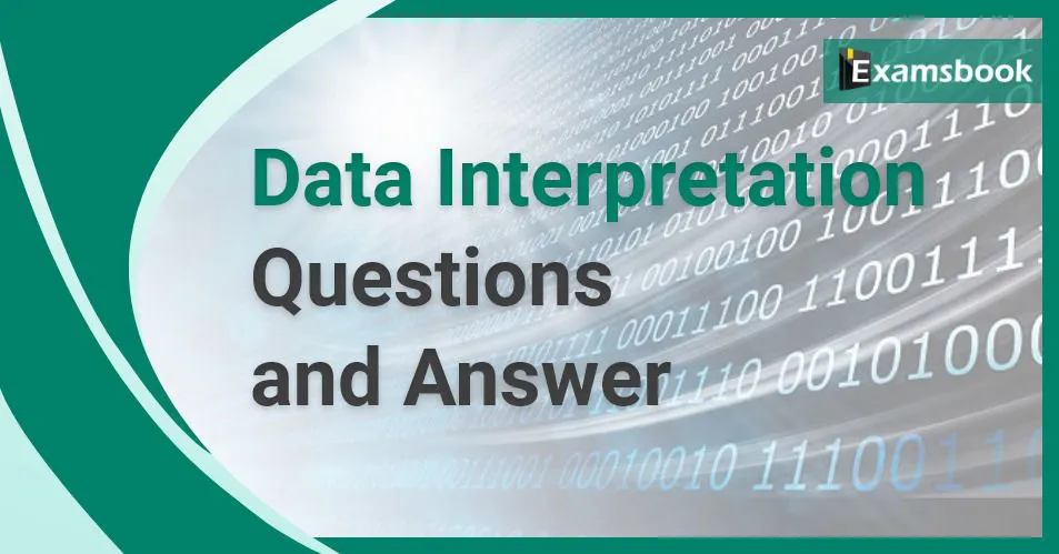
Direction: The pie chart shows the breakup of expenditure of a software company for the year 2017. Study the diagram and answer the following questions.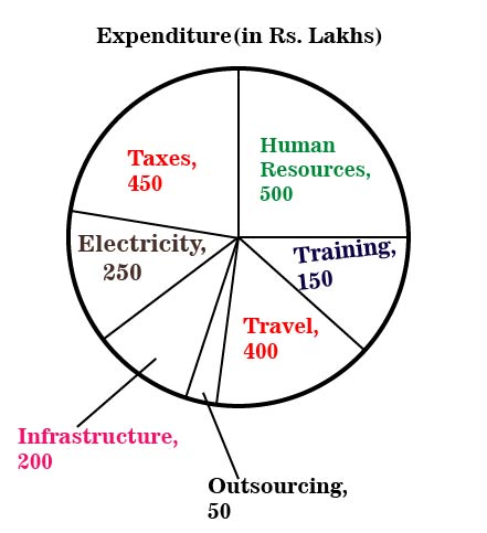
What is the total expenditure (in Rs. lakhs)?
(A) 1800
(B) 2000
(C) 2100
(D) 2250
Correct Answer : B
The following pie diagram gives the marks scored by a student in different subjects - English, Hindi, Mathematics, science and social science in an examination. Assuming that the total marks obtained for the examination are 540, answer the question
The total marks scored in Hindi and Mathematics exceed total marks scored in English and Social science by
(A) 30
(B) 40
(C) 60
(D) 75
Correct Answer : B
The following pie diagram gives the marks scored by a student in different subjects - English, Hindi, Mathematics, science and social science in an examination. Assuming that the total marks obtained for the examination are 540, answer the question
The subject in which the student scored 105 marks is
(A) Mathematics
(B) Science
(C) English
(D) Hindi
Correct Answer : D
The following pie diagram gives the marks scored by a student in different subjects - English, Hindi, Mathematics, science and social science in an examination. Assuming that the total marks obtained for the examination are 540, answer the question
The marks scored in English, Science and Social science exceed the marks scored in Hindi and Mathematics by.
(A) 80
(B) 60
(C) 100
(D) 110
Correct Answer : B
Direction: The pie chart shows the breakup of expenditure of a software company for the year 2017. Study the diagram and answer the following questions.
The second highest expenditure is for which item?
(A) Training
(B) Travel
(C) Taxes
(D) Human resources
Correct Answer : C
Directions: In the following questions, the Graph shows the demand and production of different companies. Study the graph and answer the questions.
The demand of company B is what percentage of the production of company F?
(A) 80%
(B) 50%
(C) 60%
(D) 70%
Correct Answer : D
Directions: In the following questions, the Graph shows the demand and production of different companies. Study the graph and answer the questions.
What is the difference between the average demand and the average production of the companies (in lakh tonnes)? [Approximately]
(A) 200
(B) 325
(C) 275
(D) 250
Correct Answer : D
Directions: In the following questions, the Graph shows the demand and production of different companies. Study the graph and answer the questions.
The production of company A is approximately what percent of the demand of company C?
(A) 60%
(B) 55%
(C) 50%
(D) 65%
Correct Answer : B
Directions: In the following questions, the Graph shows the demand and production of different companies. Study the graph and answer the questions.
What is the ratio of the companies having more demand than production to those having more production than demand?
(A) 3 : 2
(B) 2 : 1
(C) 2 : 3
(D) 1 : 2
Correct Answer : D
Directions: The marks obtained by 273 examinees are shown by the frequency polygon. Given that mean marks is 59.5. Study the frequency polygon and answer the given questions.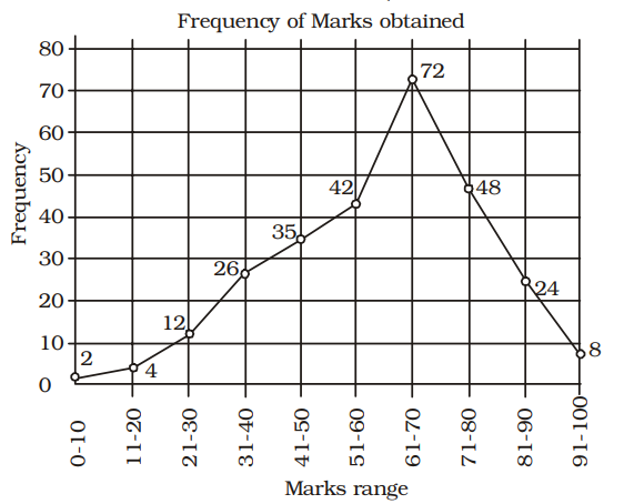
The number of examinees getting more than average marks is
(A) 152
(B) 164
(C) 72
(D) 105
Correct Answer : A
Showing page 3 of 6
enhttps://www.examsbook.com/data-interpretation-question-and-answer/363data-interpretation-question-and-answerAbout author

Vikram Singh
Providing knowledgable questions of Reasoning and Aptitude for the competitive exams.
Read more articles